


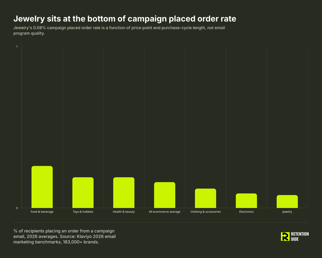
If you run email for a jewelry brand and you’ve ever pulled up an industry benchmark report, you’ve had this moment: your campaign placed order rate is sitting at 0.08%, the “all ecommerce” average says 0.16%, and food and beverage brands are up at 0.26%. The instinct is to assume something is broken. It isn’t. It’s the wrong comparison.
Jewelry email programs sit at the bottom of almost every cross-industry benchmark table, and they sit there for structural reasons that have nothing to do with program quality. Long consideration cycles, high average order values, gifting-driven purchase timing, and last-click attribution that undercounts assisted conversions all push jewelry numbers below the “all ecommerce” line. A customer who opens an email about a $400 necklace and comes back three weeks later to buy it rarely gets counted as an email-attributed conversion in a standard last-click model. That’s not a program failure. That’s how the category behaves.
This article is about separating the benchmarks that genuinely tell you something about your jewelry email program from the ones that will send you chasing the wrong fix. We already covered the broader picture in our ecommerce email marketing benchmarks piece using Klaviyo’s 2026 data and Omnisend’s 2025 report. This piece goes narrower: what those same datasets say specifically about jewelry, and how to read them without misdiagnosing a healthy program as an underperforming one.
What you’ll learn
- Why jewelry numbers land at the bottom of most industry benchmark tables, and why that’s structural rather than a warning sign
- The specific jewelry rows from Klaviyo’s 2026 benchmark data, compared to the all-industry average
- Five benchmarks worth tracking for a jewelry program, and five that should be ignored or heavily discounted
- A diagnostic order for investigating a below-benchmark number instead of guessing at a fix
Why jewelry email benchmarks read differently
Every cross-industry benchmark report ranks verticals against each other on the same handful of metrics: open rate, click rate, and placed order rate. That ranking works fine for comparing food and beverage brands against other food and beverage brands. It works poorly the moment jewelry gets pulled into the same table as categories with fundamentally different purchase mechanics.
Jewelry has three things working against it in any blended benchmark table. First, average order value sits well above the ecommerce norm, commonly in the $180 range for fashion accessories and $500 or more for fine jewelry, against a general ecommerce average closer to $143. Higher price points mean longer decision windows. Second, jewelry purchases are heavily gifting-driven, which means demand clusters around specific calendar moments (Valentine’s Day, Mother’s Day, the holiday season) rather than spreading evenly across the year the way a consumables purchase pattern does. Third, attribution models built on last-click logic simply don’t capture a purchase that happens weeks after the triggering email, which is common when someone is deciding on a four-figure item.
Put those three together and you get a category that will always look weaker than food and beverage or health and beauty on any metric measuring immediate campaign-driven purchase. That doesn’t mean jewelry email doesn’t work. It means the standard scorecard is measuring the wrong window for how this category actually buys.
The benchmark tables: jewelry vs other verticals
Klaviyo’s 2026 benchmark analysis, drawn from more than 183,000 brands, gives a clean look at where jewelry sits relative to other verticals. On campaign metrics, jewelry’s open rate (32.5%) and click rate (1.6%) are close to the all-industry averages (31% and 1.69%, respectively). The gap opens up on placed order rate, where jewelry’s campaign number is 0.08% against an all-industry average of 0.16%, the lowest of any listed vertical. For comparison, food and beverage sits at 0.26%, toys and hobbies and health and beauty both sit at 0.19%, clothing and accessories at 0.12%, and electronics just above jewelry at 0.09%, per Klaviyo’s 2026 email marketing benchmarks by industry.
The flow side tells a different story. Jewelry’s flow placed order rate comes in at 1.85%, against an all-industry flow average of 2.11%. That’s roughly 12% below average, a real but modest gap, nothing like the 50% shortfall jewelry shows on campaigns. Flow open rate (32.8%) and flow click rate (5.42%) also track close to the all-industry averages of 32.2% and 5.58%.
That asymmetry is the single most useful thing in the entire dataset for a jewelry operator. Jewelry customers convert in high-intent, behavior-triggered moments (an abandoned cart, a browse follow-up, a post-purchase reminder) far more reliably than they convert off a broadcast promotional send. The category’s placed order rate problem is almost entirely a campaign problem, not a flow problem. If you’re benchmarking your program against a blended number that mixes flows and campaigns together, you’re hiding the exact signal that matters most.
What to compare
Five benchmarks hold up well for a jewelry program, as long as you calibrate them to the category rather than to a blended ecommerce average.
Deliverability floor. This one isn’t jewelry-specific, it’s foundational to every category. Inbox placement at or above 85% is healthy. Below 80% is a warning. Below 70% is an active problem with measurable revenue impact. Spam complaint rates should trend toward 0.1%. None of the placed-order or click benchmarks below mean anything if the mail isn’t reaching the inbox in the first place.
Flows and campaigns, measured separately. Given the 1.85% versus 0.08% split, blending flow and campaign performance into one number erases the most important read on a jewelry program. Track flow placed order rate against the 1.85% jewelry baseline, and track campaign placed order rate against the 0.08% baseline, but never average them together.
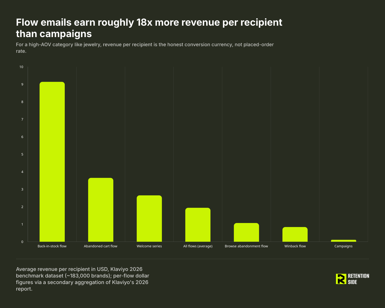
Revenue per recipient over placed order rate. When your average order value runs $180 to $500-plus, a raw conversion percentage understates the value of every send. Revenue per recipient normalizes for price point and gives a truer read on channel value. On Klaviyo’s 2026 data, flow emails average roughly $1.94 in revenue per recipient against $0.11 for campaigns, an 18x gap that matters even more for a high-ticket category than for a low-AOV one.
Repeat purchase rate on a jewelry-calibrated window. Jewelry’s repeat behavior looks nothing like a consumables business, and it shouldn’t be judged against one. Consumables run 45-55% repeat purchase rates at 365 days. Jewelry and luxury sit far lower: a 12-month repeat rate in the 11-20% range is generally considered healthy for the category, and one widely cited luxury retail benchmark puts first-time-to-second-purchase conversion for luxury and jewelry customers at around 9.9%, the lowest of any retail category tracked. If you’re comparing your repeat rate to a 28% cross-vertical average, you’ll conclude you have a retention problem when you may simply have a normal jewelry pattern.
Time between orders, calibrated to the gifting calendar. Cross-vertical data on repeat purchase timing shows that roughly half of repeat customers return within 30 days, and about 76% return within 90 days, but jewelry’s repeat cycle tends to cluster around gifting occasions rather than a steady replenishment rhythm. Layer your time-between-orders metric on top of your gifting calendar, not a flat 30/60/90-day grid. It’s also worth noting that Klaviyo’s 2025 data found average SMS campaign revenue per recipient exceeding email in several verticals, jewelry included, which is a real argument for testing SMS as a companion channel around key gifting windows rather than relying on email alone.
What to ignore
Five numbers get repeated constantly in benchmark discussions and deserve far less weight than they get, especially for jewelry.
Open rate as an absolute figure. Apple’s Mail Privacy Protection changed what an “open” even means. Roughly 64% of B2C email subscribers now use an Apple Mail client capable of pre-fetching images and registering a false open, and industry estimates put the resulting inflation at 35-68% for those users. Klaviyo itself now describes open rate as a directional signal rather than a hard performance number. Comparing your open rate year over year, or against a pre-MPP benchmark, tells you very little.
Cross-industry open-rate rankings. Omnisend’s 2025 data found wedding brands posting the highest open rate of any tracked vertical, 52.43%, while converting at just 0.04%. Games brands hit 36.85% open with 0.19% conversion. High open rates and high conversion rates aren’t the same signal, and a league table built on open rate alone is ranking the wrong outcome.
Blended campaign-versus-flow numbers. We covered this above, but it’s worth restating as its own rule: any benchmark that averages flow and campaign performance into a single figure is hiding the 13x-plus structural gap between the two send types. For jewelry specifically, that blending disguises the fact that campaigns are the weak point, not flows.
Universal “email should drive X% of revenue” targets. These figures get passed around as if they apply evenly across categories, but the honest answer is that they’re category-dependent. A consumables brand with weekly reorder behavior will naturally pull a different revenue share from email than a jewelry brand with occasion-driven purchase cycles. Track your own trajectory over time instead of chasing someone else’s percentage.
Discount-conditioned engagement. A strong Q4 campaign cycle built on markdowns can look like a great quarter on paper while masking a weak non-sale repeat rate. If your subscribers only respond when there’s a discount attached, that’s a signal about audience conditioning, not a benchmark win. This shows up especially fast in a gifting-heavy category like jewelry, where holiday-driven volume can paper over a flat pattern the rest of the year.
How to diagnose a below-benchmark number
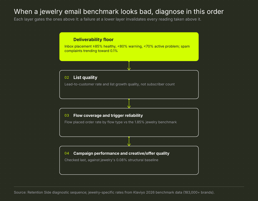
When a number comes in under benchmark, the instinct is to fix whatever’s closest to the surface, usually subject lines or creative. That’s almost always the wrong place to start. The more reliable approach is to work through layers in a fixed order, because a problem at a lower layer will distort every reading above it.
Start with deliverability. If inbox placement is below your healthy threshold, every click and placed-order number above it is unreliable, because you’re not actually reaching the audience you think you’re reaching. Next, check list quality, specifically lead-to-customer rate rather than raw list size or form submission rate. A smaller, higher-intent list will consistently outperform a larger, poorly qualified one. Third, check flow coverage and trigger reliability, comparing your flow placed order rate against the 1.85% jewelry baseline. Only after those three layers check out should you move to campaign performance and creative or offer quality, evaluated against jewelry’s 0.08% structural baseline rather than a blended average.
Fixing the top layer without addressing a problem underneath it produces a temporary bump at best. If deliverability is the actual issue, a new subject line strategy won’t move the needle for long.
Bringing it back to your own numbers
Benchmarks are context, not a scoreboard. They tell you what’s structurally normal for a category built around high price points, long decision windows, and gift-driven timing, and they help you spot when a number is genuinely off versus simply category-typical. What they don’t do is tell you what to fix, and treating every below-average metric as a directive to rebuild your program is how good jewelry email operations get dismantled for the wrong reasons.
The real read on a jewelry program comes from flow conversion rates, revenue per recipient, repeat purchase rate against jewelry-calibrated windows, and time between orders mapped to your gifting calendar, all sitting on top of a healthy deliverability floor. That’s the diagnostic work we do as a matter of course at Retention Side when we take over a retention system for a jewelry or luxury brand: check the floor first, then work up through list quality, flow coverage, and campaign performance, so the fix actually matches the layer where the problem lives.