


Every brand we start working with has the same first question: “what percentage of our revenue actually comes from email?” Klaviyo will hand you a number in the dashboard within seconds. The problem is that number is easy to misread, easy to game accidentally, and often gets pulled into board decks as if it were gospel.
Klaviyo revenue attribution is not a single, objective truth about how your revenue happens. It’s a reporting model, built on specific rules about attribution windows, click tracking, and last-touch logic. Once you understand how that model works, and where it breaks down, you can actually use it to make good decisions instead of chasing a vanity metric that moves for reasons that have nothing to do with your retention program.
This article breaks down how Klaviyo calculates attributed revenue, why the number you see is almost never the full incrementality picture, what healthy benchmarks actually look like across real DTC portfolios, and how to build a reporting habit that tells you the truth instead of a story you want to hear.
Key takeaways
- Klaviyo attributes revenue based on tracked clicks (and opens, if you have it configured) within a set attribution window, using a last-touch model by default.
- Attributed revenue is not the same as incremental revenue. A meaningful share of what Klaviyo credits to email would have converted through another channel or organically.
- Flows and campaigns should be read separately. They serve different jobs in the customer lifecycle, and blending them into one number hides where your program is actually working or failing.
- Attribution windows, UTM hygiene, and click tracking settings can shift your reported numbers by 20 to 40 percent without anything about your actual program changing.
- Across real DTC portfolios, email-attributed revenue typically ranges from roughly 10 percent for underperforming programs to 35 percent or more for mature, well-segmented ones.
- A drop in attributed revenue doesn’t always mean your email program broke. It can reflect traffic quality, acquisition mix changes, or website conversion issues just as easily.
What we’ll cover
We’ll walk through how Klaviyo’s attribution model technically works, why the attributed number diverges from incrementality, how to separate flow performance from campaign performance, what benchmark ranges look like across brand maturity levels, and the reporting cadence we use at Retention Side to keep clients grounded in reality rather than dashboard noise.
How Klaviyo actually calculates attributed revenue
Klaviyo’s attribution model is built around tracked engagement, not guesswork. When a subscriber clicks a tracked link in an email, SMS, or push notification, Klaviyo appends UTM parameters and watches for a purchase event within a defined window. If that purchase happens within the window, the revenue gets credited to that message.
By default, Klaviyo uses a last-touch attribution model within its own channel logic: whichever email or SMS the customer clicked last before purchasing gets the credit. This matters more than people realize. If a subscriber clicks three different campaigns over five days and then buys, only the final click typically gets the credit in the standard attributed revenue reports, not all three.
There are two attribution windows at play:
- Click-based attribution window: the default is often set to a longer window (Klaviyo’s standard is a rolling window, commonly configured around 5 days for email, though this is adjustable in account settings).
- Open-based attribution: if enabled, opens can also generate attributed revenue credit, which tends to inflate numbers because opens are a much weaker signal of intent than clicks, especially with Apple Mail Privacy Protection auto-triggering opens on inboxes that never engaged.
This is one of the first things we check in an account audit. Brands that still have open-based attribution switched on are often reporting inflated numbers that don’t reflect real subscriber behavior. If your open tracking is compromised by MPP or Gmail’s image caching behavior, and you’re still crediting revenue off opens, you’re building your reporting on a foundation that partially isn’t real anymore. This is closely tied to broader email deliverability issues: if you can’t trust your open data because of privacy protections and inbox provider proxy loading, you shouldn’t be building attribution logic on top of it either.
Last-click vs multi-touch inside Klaviyo
Klaviyo’s native reporting is fundamentally last-touch. It does not natively distribute partial credit across multiple touchpoints the way a full multi-touch attribution model would. This is a meaningful limitation for brands running heavy cross-channel programs, because a customer who saw three retargeting ads, opened four emails, and got an SMS reminder before buying will have 100 percent of that revenue credited to whichever channel they clicked last.
This is exactly why attribution model choice changes the story so dramatically. The chart below shows how the same pool of revenue gets split completely differently depending on whether you’re looking at last-click, first-click, or a multi-touch view.
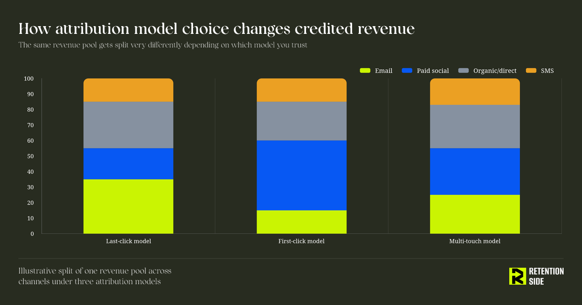
Under a last-click lens, email tends to look stronger than it deserves credit for, because email is frequently the final nudge before checkout, even when paid social or organic search did the actual work of building intent. Under a first-click lens, email often looks weaker, because paid acquisition usually introduces the customer first. Multi-touch sits somewhere in between and is the most honest picture, but it’s also the hardest to build without a dedicated analytics layer sitting on top of Klaviyo and your ad platforms.
The practical takeaway: don’t treat Klaviyo’s attributed revenue number as a full picture of channel performance. Treat it as one lens, specifically a last-touch, click-based lens, and interpret it accordingly.
Why attributed revenue is not the same as incremental revenue
This is the distinction that causes the most confusion in board meetings and budget conversations. Attributed revenue tells you which messages were present at the moment of purchase. Incremental revenue tells you how much of that purchase would not have happened without that message.
Those are very different things. A customer on your winback flow who was already planning to reorder because they run out of product every 30 days is going to buy regardless of whether your flow email lands. Klaviyo will still credit that purchase to the flow if they clicked through it, because the click-to-purchase window was satisfied. But the flow didn’t create that revenue. It just happened to be present.
This doesn’t mean attributed revenue is useless. It means you need to read it with the understanding that a portion of it is capturing revenue that would have converted anyway. The size of that portion depends heavily on:
- How habitual the purchase is (replenishable consumables vs considered purchases)
- How strong your brand demand already is outside of email
- Whether the customer was already in an active buying window (cart abandoners, browse abandoners, post-purchase replenishment timing)
Flows built around high-intent moments, like cart abandonment or browse abandonment, will always show strong attributed revenue because they’re intercepting people who were already close to converting. That’s valuable, since a flow that recovers otherwise-lost carts is doing real incremental work. But a welcome flow discount that fires for every new subscriber, many of whom would have converted on their first site visit anyway, is a different story. Some of that attributed revenue is real lift. Some of it is just discount margin given away to people who didn’t need the incentive to buy.
The way we frame this with clients: attributed revenue answers “where was the customer’s attention when they bought.” Incrementality answers “did our message change the outcome.” You need both questions, and Klaviyo’s dashboard only answers the first one.
Benchmarks: what a healthy attribution range actually looks like
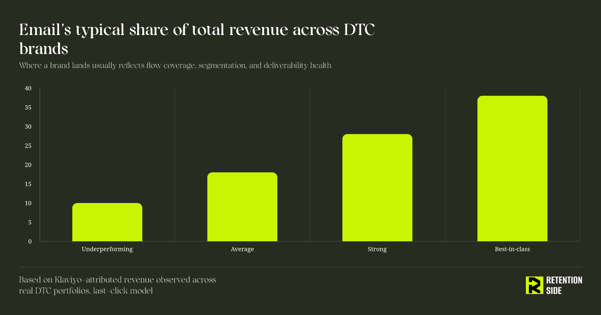
Founders often ask us for a single benchmark number, as if there’s one correct percentage every brand should hit. There isn’t. Attribution share depends on product category, purchase frequency, average order value, subscriber list health, and how mature the flow and segmentation architecture is.
That said, patterns do show up consistently across real DTC portfolios. Brands with thin flow coverage, weak segmentation, and inconsistent campaign cadence tend to sit at the low end. Brands with a full flow build, disciplined segmentation, and healthy deliverability sit meaningfully higher.
A few patterns worth noting from where brands typically land:
- Underperforming programs (around 10 percent): usually running only the default flows Klaviyo installs out of the box, minimal segmentation beyond basic buyer/non-buyer splits, and campaigns sent to the full list regardless of engagement.
- Average programs (around 18 percent): have a reasonable flow library and some segmentation, but often lack a real winback strategy, cross-sell logic, or a disciplined sunset process for disengaged subscribers.
- Strong programs (around 28 percent): full flow coverage mapped to customer journey stages, active segmentation by purchase behavior and engagement, and a healthy balance between promotional and value-driven campaigns.
- Best-in-class programs (38 percent or higher): this usually shows up in consumable or replenishable product categories with strong list growth quality, deep segmentation built on Klaviyo’s segmentation strategy, and deliverability practices that keep inbox placement consistently high.
If your number is well below these ranges, the issue is rarely “email doesn’t work for us.” It’s almost always a gap in flow coverage, segmentation depth, or deliverability, which is exactly what we dig into first during an account audit rather than assuming the channel itself is underperforming.
Flows vs campaigns: how attribution splits and what it tells you
One of the most useful things you can do with Klaviyo’s attribution data is separate flows from campaigns and look at each independently, rather than staring at a single blended “email revenue” line.
Flows are behavior-triggered and tend to convert at a much higher rate per recipient because they’re firing based on an action the customer just took: abandoning a cart, browsing a product page, completing a first purchase. This is why flows often account for a disproportionate share of attributed revenue relative to send volume. A well-built flow library, sending to a fraction of the volume that campaigns do, will frequently produce 40 to 60 percent of total email-attributed revenue.
Campaigns, by contrast, depend entirely on segmentation quality and cadence discipline. A campaign blasted to your full list will show weaker attributed revenue per recipient than one sent to a tightly built segment of recently engaged, high-intent subscribers. This is the core reason campaign strategy has to be built around segmentation rather than a single “send to everyone” habit. If your campaigns are the majority of your list’s touchpoints and they’re only ever promotional, you’ll also see engagement decay over time, which drags attributed revenue down across both campaigns and flows because deliverability and list health degrade together.
When we review an account, we’re looking at this split specifically:
- What percentage of attributed revenue comes from flows vs campaigns
- Which individual flows are carrying disproportionate weight (and whether under-tested flows are being ignored)
- Whether campaign attributed revenue is trending down because of list fatigue, not creative or offer quality
This split tells you where to actually invest your next quarter of work. A brand with weak flow-attributed revenue needs flow builds and testing before it needs more campaign volume. A brand with strong flows but weak campaign attribution usually has a segmentation or cadence problem, not a channel problem.
How to build a reporting cadence that doesn’t lie to you
Attribution numbers are only useful if you’re reading them consistently and asking the right follow-up questions. Here’s the cadence we use with clients to keep the data honest:
- Weekly: flow performance by stage (welcome, abandonment, post-purchase, winback), watching for placement issues, click-through rate shifts, and unusual attributed revenue swings tied to specific flows.
- Monthly: campaign attributed revenue against segment size and send frequency, checking whether engagement-based segmentation is actually protecting deliverability or whether the full list is still getting blasted.
- Quarterly: a full attribution review against acquisition trends. If total site traffic dropped, or paid acquisition shifted toward colder audiences, expect email-attributed revenue to move even if nothing in your Klaviyo account changed. Retention doesn’t operate in isolation, and a swing in attributed revenue often has more to do with what’s happening upstream in acquisition and on-site conversion than with anything inside the flows or campaigns themselves.
A few specific checks worth running every quarter, regardless of brand size:
- Confirm your attribution window setting hasn’t drifted and matches your actual purchase cycle (a 5-day window makes little sense for a considered purchase with a 20-day average buying cycle).
- Confirm open-based attribution is off if your open data is compromised by Apple MPP or Gmail image proxying.
- Cross-check Klaviyo’s attributed revenue against your analytics platform’s channel breakdown. If the numbers are wildly different, it usually points to UTM inconsistency or double-counting somewhere in the funnel.
- Look at attributed revenue per email sent, not just total attributed revenue, especially when comparing performance across different list sizes or time periods.
Common mistakes that inflate or deflate the numbers
We see the same handful of mistakes across almost every new account we audit:
Leaving open-based attribution enabled with degraded open data. This inflates attributed revenue with false signal, especially on Apple Mail-heavy lists where automated opens fire regardless of real engagement.
Using an attribution window that doesn’t match the buying cycle. A too-short window undercounts considered purchases. A too-long window over-credits email for purchases that were largely driven by other channels that happened to occur later in the window.
Blending flows and campaigns into one number for leadership reporting. This hides whether growth is coming from better-triggered automation or from list-wide promotional sends, which have very different implications for list health and long-term engagement.
Not accounting for coupon and discount cannibalization. If your welcome flow’s attributed revenue looks strong but it’s driven entirely by a 20 percent off code, you’re not necessarily looking at incremental lift. You may be looking at margin given away to customers who would have purchased at full price.
Treating a dip as proof the channel failed. If attributed revenue drops in a given month, the first question shouldn’t be “what’s wrong with email.” It should be “what changed upstream,” including traffic volume, acquisition channel mix, site conversion rate, and even seasonality. Email performance is downstream of all of these.
Where Retention Side fits into this picture
We approach Klaviyo revenue attribution the same way we approach the rest of a retention system: as one signal inside a larger picture, not the entire scoreboard. Part of what we do in an initial account audit is checking attribution window settings, open-tracking configuration, and UTM consistency before we ever make a recommendation based on the reported numbers. If the underlying data collection is off, no strategic decision built on top of it will be sound.
From there, we look at the flow-vs-campaign split, benchmark it against what we see across other portfolios in similar categories, and build a plan that targets the actual gap, whether that’s flow coverage, segmentation depth, deliverability health, or campaign cadence discipline. This is also where Klaviyo revenue attribution connects to the broader question we get from almost every brand considering outside help: what a Klaviyo email marketing agency should actually be doing month to month, and whether the reporting they’re handing you reflects real strategic thinking or just a recycled dashboard export.
Conclusion
Klaviyo’s attributed revenue number is useful, but it’s a lens, not a verdict. It tells you where the customer’s last click happened before they bought, filtered through your attribution window and open-tracking settings. It doesn’t tell you what would have happened without that message, and it doesn’t separate the very different jobs that flows and campaigns are doing inside your lifecycle.
Read it correctly and it becomes one of the more honest tools you have for diagnosing where a retention program is strong and where it’s thin. Read it uncritically and it becomes a number that goes up and down for reasons that have nothing to do with your actual email strategy, while everyone in the room assumes it does. The goal isn’t to chase a higher attributed revenue percentage in isolation. It’s to build flows, segmentation, and campaign discipline strong enough that the number reflects a retention system actually doing its job, not a reporting artifact of window settings and last-click logic.