


Most Shopify merchants benchmark their email program against the wrong numbers. Open rate and click rate get quoted in every roundup post and platform report, but neither one tells you whether email is actually driving repeat purchases, protecting margin, or building the kind of customer relationship that compounds over time. They’re intermediate metrics. They measure whether someone looked at a message, not whether your retention system is working.
That distinction matters more on Shopify than almost anywhere else, because Shopify’s ecosystem runs disproportionately on one platform: Klaviyo. Its native Shopify integration and behavioral trigger depth are why it has become the default choice for brands serious about retention, and it’s also why Klaviyo’s benchmark data, built from hundreds of thousands of stores, is the most relevant reference point for Shopify operators specifically. Add in the fact that Apple’s Mail Privacy Protection has inflated open rate data across the entire industry since 2021, and you have a benchmarking environment where the most visible numbers are also the least trustworthy.
This article walks through the benchmarks that actually matter for a Shopify brand doing meaningful revenue: deliverability thresholds, campaign performance by category, the revenue gap between campaigns and flows, revenue per recipient, email’s realistic share of total store revenue, and repeat purchase rate. The goal isn’t to hand you a scorecard. It’s to give you the context to interpret your own numbers correctly, and to know which deviations are worth investigating.
What this article covers
- Why Klaviyo’s benchmark data carries more weight for Shopify merchants than cross-platform averages
- Deliverability thresholds that determine whether any other benchmark matters
- Campaign benchmarks by industry, and why placed order rate matters more than open rate
- Why automated flows generate a disproportionate share of email revenue
- Revenue per recipient (RPR) as the metric that actually ties email to business outcomes
- What percentage of total Shopify store revenue email should realistically drive
- Repeat purchase rate benchmarks and why category context changes the target
- List growth and unsubscribe benchmarks, and how to diagnose underperformance without chasing the wrong fix
The Shopify email landscape: what platform you’re on shapes your benchmarks
Before comparing your numbers to any benchmark, it’s worth asking where that benchmark came from. Email platforms report meaningfully different ecommerce averages, and the gap isn’t random noise, it reflects who uses each platform and how.
Klaviyo’s 2026 benchmark data, drawn from more than 183,000 brands, puts the average campaign open rate across all industries at 31%, with the top 10% of senders reaching 45.1%. Average campaign click rate sits at 1.69%. Klaviyo’s benchmark report is built almost entirely from ecommerce brands, many of them on Shopify, which makes it the most structurally relevant dataset for a Shopify operator.
Compare that to Mailchimp’s published benchmarks, which show an ecommerce open rate of 29.81% and click rate of 1.74%, against an all-user average open rate of 35.63%. Mailchimp’s base includes far more small businesses, newsletters, and non-transactional senders, which pulls the blended numbers in a different direction than a platform built specifically for commerce.
MailerLite’s 2025 data, covering 3.6 million campaigns across 181,000 accounts, shows an ecommerce open rate of 32.67% and a click rate of 1.07%, with unsubscribe rates that doubled year over year, from 0.08% to 0.22%, a shift they attribute to Gmail’s simplified one-click unsubscribe experience.
| Platform | Ecommerce open rate | Ecommerce click rate |
|---|---|---|
| Klaviyo (2026) | 31% (45.1% top 10%) | 1.69% |
| Mailchimp | 29.81% | 1.74% |
| MailerLite | 32.67% | 1.07% |
The range, roughly 29% to 33%, isn’t a rounding error. It reflects different sending populations, different list hygiene practices, and different measurement windows. If you’re running Klaviyo on Shopify, which most meaningful DTC brands are, Klaviyo’s own benchmark data is the more honest comparison point. Cross-platform numbers are useful context, not a target to hit.
The deliverability floor: thresholds that determine whether anything else matters
None of the benchmarks below mean anything if your emails aren’t reaching the inbox. This is the part of email marketing that gets the least attention relative to how much it determines everything downstream, and it’s worth being precise about the terminology, because the two concepts get used interchangeably when they shouldn’t be.
Delivery rate measures whether the receiving server technically accepted your email. Deliverability measures whether that email actually landed somewhere useful, the primary inbox, rather than getting filtered into spam or buried in a promotions tab. A campaign can show a 99% delivery rate and still perform poorly because half of those “delivered” emails never reached a place the recipient would see them.
This distinction has gotten more consequential since Gmail, Yahoo, and Outlook formalized hard sender requirements for bulk senders. Authentication (SPF, DKIM, DMARC), spam complaint thresholds, and list engagement now directly determine inbox placement, not just delivery. Gmail in particular filters based on engagement signals across your entire sending history, which means a list full of subscribers who never open or click is actively damaging your sender reputation with every campaign you send, even if those same subscribers show a “delivered” status.
For a Shopify brand, this means list hygiene isn’t a nice-to-have retention practice, it’s deliverability infrastructure. Suppressing chronically unengaged segments, sunsetting cold subscribers, and keeping sending patterns consistent all protect the inbox placement that every other benchmark in this article depends on. If your open rates and click rates are declining across the board, check deliverability before you touch subject lines or send times. A reputation problem looks like a content problem until you isolate it.
Campaign benchmarks by industry (Klaviyo 2026 data)
Once deliverability is accounted for, campaign benchmarks become useful as a directional check, provided you’re comparing against your specific category rather than a blended average. Klaviyo’s 2026 data breaks out open rate, click rate, and placed order rate across the industries most relevant to Shopify merchants:
| Industry | Open rate | Click rate | Placed order rate |
|---|---|---|---|
| Food & Beverage | 31.2% | 1.94% | 0.26% |
| Toys & Hobbies | 31.7% | 2.03% | 0.19% |
| Health & Beauty | 30.5% | 1.63% | 0.19% |
| Home & Garden | 32.5% | 1.83% | 0.13% |
| Clothing & Accessories | 33.1% | 1.62% | 0.12% |
| Sporting Goods | 31.9% | 1.88% | 0.11% |
| Electronics | 29.3% | 1.77% | 0.09% |
| Jewellery | 32.5% | 1.54% | 0.08% |
| All-industry average | 31% | 1.69% | 0.16% |
The number worth paying attention to here is placed order rate, not open rate. Food & Beverage and Jewellery have nearly identical open rates, 31.2% versus 32.5%, but Food & Beverage converts campaign sends into placed orders at more than three times the rate. If you only tracked open rate, you’d conclude these categories perform similarly. They don’t. One is driving three times the revenue outcome per send.

This is the practical case against treating open rate as a primary KPI: it can be nearly identical across categories with wildly different revenue performance. Placed order rate connects the campaign directly to a transaction, which makes it a far more honest signal of whether your campaign strategy is working. If your placed order rate sits meaningfully below your category’s benchmark while your open rate looks fine, the problem usually isn’t your subject lines. It’s your offer, your segmentation, or your landing experience after the click.
Automated flow benchmarks: where the revenue actually lives
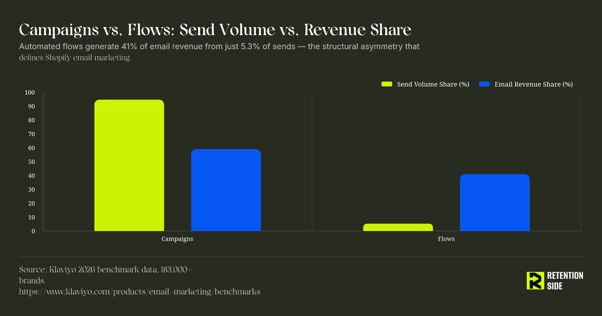
This is the single most important structural fact in Shopify email marketing, and it’s the one most benchmark roundups bury. According to Klaviyo’s 2026 data, automated flows generate nearly 41% of total email revenue while accounting for only 5.3% of total send volume. Campaigns make up the remaining 94.7% of sends but contribute a smaller share of revenue relative to their volume. Flow revenue per recipient runs nearly 18 times higher than campaign RPR, and flow click rates average 5.58%, more than three times the 1.69% campaign average. Flow placed order rates run roughly 13 times higher than campaign placed order rates.
There’s another detail in this data that matters strategically: 48% of flow-driven revenue comes from new buyers, compared to just 16% for campaigns. Flows aren’t just more efficient, they’re doing more of the acquisition-to-retention conversion work than campaigns are.
Here’s what that looks like at the individual flow level:
Abandoned cart remains the highest-value automated flow on a per-send basis. Klaviyo’s 2025 benchmark data put average RPR for abandoned cart flows at $3.07, compared to $0.10 for the average campaign, a 30x gap. Within the flow itself, the first email, sent within one to two hours of abandonment, typically captures 45% to 55% of the total revenue the entire sequence generates. That’s not a reason to skip the second and third emails, but it does mean the first send deserves the most scrutiny when you’re optimizing: timing, incentive structure, and product visibility in that first message carry outsized weight.
Browse abandonment operates on weaker purchase intent than cart abandonment, since the visitor never added anything to cart, but it typically reaches a larger audience because more people browse than add to cart. Treat it as a lower-intent, higher-volume complement to cart recovery, not a replacement.
Welcome series, post-purchase, and win-back flows each serve a different retention function and shouldn’t be benchmarked purely on revenue. A welcome series is often the first deliverability signal Gmail and Yahoo receive about a new subscriber relationship, a post-purchase flow can prevent buyer’s remorse and set expectations, and a win-back flow re-engages customers before they lapse permanently. Not every flow exists to generate direct revenue, and judging a post-purchase flow purely on RPR misses what it’s actually built to do.
The top 10% of flows across Klaviyo’s dataset achieve RPR as high as $7.79 with click rates exceeding 10%. That gap between average and top-decile performance is almost entirely a function of flow architecture, segmentation logic, and ongoing testing, not list size or brand recognition. Flows are never finished when they launch. They’re starting points that should be tested and refined the same way you’d iterate on a landing page.
Revenue per recipient: the metric that ties email to business outcomes
Revenue per recipient (RPR), total revenue generated divided by the number of recipients who received the send, is the closest thing to a single number that connects an email send to actual business performance. It accounts for open rate, click rate, and conversion rate all at once, which is exactly why it’s a better diagnostic than any of those metrics in isolation.
Benchmark ranges vary somewhat by source and year, but the pattern is consistent: Klaviyo’s 2025 data put average campaign RPR at $0.10, with 2024 data showing $0.11, a stable range. Abandoned cart flow RPR sat at $3.07 in 2025 and $3.65 in 2024. The gap between top and average performers is where this metric earns its usefulness. Klaviyo’s data shows the top 10% of campaigns generate order rates 5 times higher and RPR roughly 7 times higher than average performers. For flows, top performers can generate up to 30 times more RPR than an average campaign.
If your campaign RPR sits meaningfully below $0.10, or your abandoned cart flow RPR sits well under $3, that’s a legitimate signal worth investigating, more legitimate than a soft open rate. But treat it as a starting point for diagnosis, not a verdict. A low RPR could mean weak segmentation, a broken flow trigger, a pricing or offer mismatch, or a deliverability issue suppressing reach before revenue ever has a chance to show up. Revenue per recipient tells you something is off; it doesn’t tell you what.
Email’s share of total Shopify store revenue
Zooming out from individual sends, one of the more useful benchmarks for a Shopify operator is what percentage of total store revenue email should realistically be driving. Well-optimized ecommerce brands typically see email contribute somewhere in the 25% to 35% range of total revenue. The median across all Shopify stores, including those with underdeveloped email programs, sits meaningfully lower, closer to 18%.
That gap is the interesting part. It’s rarely explained by traffic volume or product category. It’s explained by program maturity: how many flows are live and properly segmented, whether campaigns balance promotional and value-driven content, how clean the list is, and whether deliverability is protecting reach. A brand doing $300K a month with email contributing 15% of revenue isn’t necessarily under-resourced on traffic, it’s likely under-built on retention infrastructure. That’s a different fix than “send more campaigns.”
This benchmark also scales with store size and maturity in a way the others don’t. A newer store with a small list and thin flow coverage will naturally sit below 25%, and that’s not a failure, it’s a stage. The number to watch isn’t where you sit today, it’s whether that share is moving upward as your flows mature and your list grows with quality subscribers rather than just volume.
Repeat purchase rate benchmarks by Shopify niche
Repeat purchase rate is the metric that most directly reflects whether your retention system, email included, is actually working, because it measures behavior rather than engagement with a message. Shopify’s own industry analysis puts average ecommerce retention around 30%, but that blended figure hides significant category variation. Apparel and fashion brands show a median 365-day repeat rate closer to 24%, reflecting purchase cycles driven by trend and seasonality rather than consumable replenishment.
A 471-store Shopify audit conducted by COREPPC in April 2026 found repeat purchase rates differ dramatically by category, consistent with the intuitive reality that a supplement brand with a 30-day consumption cycle should be benchmarking against a very different repeat rate than a furniture brand where the natural repurchase window might be years, not months. Comparing those two brands against the same blended industry average produces a meaningless conclusion in both directions.
The practical implication: pull your own category’s repeat purchase benchmark before deciding whether your number is a problem. If you’re a consumable brand sitting below 24%, that’s a real signal, likely pointing at post-purchase flow gaps, replenishment timing misses, or a win-back sequence that isn’t triggering at the right interval. If you’re a considered-purchase category naturally repeating less often, the more useful metric might be time between orders or customer lifetime value trajectory rather than repeat rate in isolation.
List growth quality and unsubscribe benchmarks
List growth gets treated as a vanity metric more often than it should, and unsubscribe rate gets treated as a red flag more often than it deserves to be. Both need context.
On unsubscribes, Mailchimp’s ecommerce data shows an average rate of 0.19%. MailerLite’s broader dataset shows 0.22% across all industries, a figure that doubled year over year from 0.08%, which they attribute largely to Gmail’s simplified unsubscribe interface making it easier for disengaged recipients to opt out with one click rather than simply ignoring emails or marking them as spam. That shift is arguably healthy for deliverability even though it looks worse on a surface-level report: an unsubscribe is a cleaner signal than a spam complaint, and it removes a subscriber who was already dragging down your engagement rate.
List growth rate benchmarks vary widely depending on acquisition strategy. Organic growth through content, referrals, and word of mouth typically runs 1% to 2% per month. Brands running well-optimized popups and forms can see monthly growth in the 8% to 15% range. But raw growth rate isn’t the number that matters, list quality is. Form submission rate is not the real KPI here; lead-to-customer rate is. A form that converts visitors into subscribers at a high rate but feeds a list that never converts into buyers isn’t actually growing your business, it’s inflating a number while potentially damaging deliverability by adding unengaged addresses to future sends. Incentive structure on those forms should be calibrated to balance conversion lift against margin protection, not maximized for opt-in volume alone.
How to diagnose underperformance without optimizing the wrong thing
A benchmark below average is a signal to investigate, not a directive to rebuild your program. The mistake most operators make is treating every soft metric as equally actionable, when in reality there’s a hierarchy to how much a given number tells you about the health of your retention system.
Start with revenue per recipient and email’s share of total store revenue. These sit closest to actual business outcomes and are the most trustworthy signals that something structural needs attention. Below those, look at conversion rate and placed order rate by flow and by campaign category, since these narrow down whether the issue is acquisition of intent (traffic and list quality) or conversion of intent (offer, landing page, flow logic). Click-through rate and click-to-open rate come next, useful for isolating content and relevance problems once you’ve ruled out structural ones. Unsubscribe rate, bounce rate, and list growth quality sit below that as hygiene indicators. Open rate belongs at the bottom of this hierarchy, directional at best given Apple Mail Privacy Protection’s distortion of the metric across roughly 46% of all email client usage, and largely unreliable as a standalone diagnostic.
When you see a drop in performance, resist the instinct to assume email itself is broken. A drop in email performance frequently traces back to something outside the channel entirely, a shift in acquisition source quality, a website conversion issue, a change in customer behavior, or a seasonal category effect that has nothing to do with your flows or copy. If repeat purchase rate is flat but campaign engagement metrics look fine, the issue is more likely structural: flow architecture, segmentation gaps, or a deliverability ceiling limiting how many engaged customers actually see your messages. If email’s share of total revenue is declining while overall store revenue is growing, that’s often an acquisition-channel shift diluting the base your retention program was built for, not a retention failure. Diagnose in that order, business outcome first, then conversion mechanics, then content, then hygiene, and you’ll spend your optimization time on what’s actually moving revenue instead of chasing an open rate that was never a reliable number to begin with.
What to actually do with these benchmarks
Benchmarks exist to give your numbers context, not to hand you a fix. A campaign open rate that sits a few points below the Klaviyo average tells you almost nothing on its own, but a placed order rate well below your category’s benchmark, paired with a repeat purchase rate that isn’t moving, tells you where to look. Build your evaluation around the metrics tied to actual customer behavior: repeat purchase rate, lead-to-customer rate, time between orders, revenue attributed to the channel, and the deliverability indicators that determine whether any of it reaches an inbox in the first place. Everything else is useful color, not the scoreboard.