


Every brand owner asks some version of this question eventually: is our email doing its job? The instinct is to want a single number, a benchmark you can hold your Klaviyo dashboard up against and know immediately whether you’re winning or leaving money on the table. That number exists, but it’s a range, not a target, and using it correctly requires understanding what actually moves it.
We work inside Klaviyo accounts across apparel, beauty, consumables, and durable goods brands doing meaningful monthly revenue, and the honest answer is that “how much should email generate” depends less on generic industry averages and more on your program’s maturity, your product’s purchase frequency, and how disciplined your flow architecture is. Let’s get into the actual numbers and, more importantly, how to think about them.
Key takeaways
- Industry-wide, email typically drives somewhere between 20% and 40% of total ecommerce store revenue, with an all-cohort average commonly cited around 27%.
- The gap between an underdeveloped program and a mature one isn’t a few percentage points. It’s often the difference between single digits and 40%+ of total revenue.
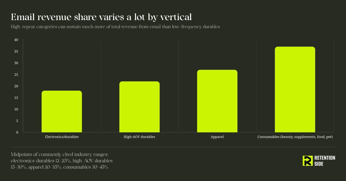
- Your vertical sets a realistic ceiling. High-repeat categories like beauty, supplements, food, and pet products can sustain 30-45%. Lower-frequency durables and electronics typically cap out lower, closer to 12-25%.
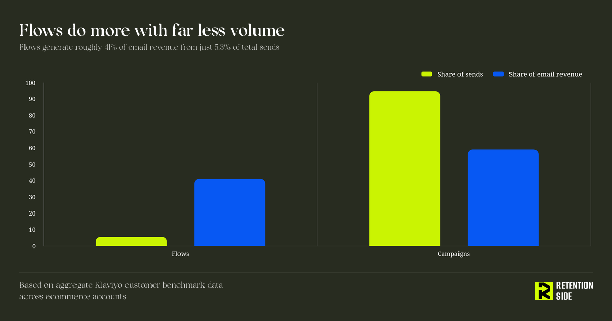
- Flows should be doing disproportionate work. Aggregate Klaviyo data shows flows generate roughly 41% of email revenue from just 5.3% of total sends, meaning automation is dramatically more efficient than campaigns per email sent.
- A low email revenue share is not always an email problem. It can just as easily be a symptom of poor list quality, weak deliverability, acquisition mismatched to retention economics, or a website that isn’t converting email traffic once it arrives.
- The goal isn’t to hit a benchmark number. It’s to build a system where flows, campaigns, segmentation, and deliverability all compound so that email’s revenue share grows because your program is actually getting better, not because you’re sending more.
What we’ll cover
This article walks through what percentage of revenue email should realistically produce, why the popular “20-30% of revenue” benchmark is often misapplied, the variables that actually set your ceiling, how flows and campaigns should split that revenue, how to calculate your real number without fooling yourself with attribution, and how to diagnose whether a shortfall is actually an email problem or something upstream in your retention system.
The honest answer: there’s a range, not a single number
Across large aggregate datasets, email consistently lands somewhere between a fifth and half of total ecommerce store revenue. Klaviyo’s own benchmark data, pulled from tens of thousands of customer accounts, puts the all-cohort average around 27%. Agencies managing curated portfolios of Klaviyo accounts often report higher averages, in the low-to-mid 30s, because their client base skews toward brands that have already invested in the channel. Brands with no real program in place, meaning a single welcome email and occasional broadcasts with no segmentation, often sit in the single digits.
So when someone tells you “email should be 25% of your revenue,” they’re quoting a real number, but it’s an average across a population that includes brands with almost no program at all sitting next to brands with a decade of list building and a fully built-out flow architecture. Averages tell you direction. They don’t tell you your target.
Why “20-30% of revenue” is the wrong way to use a benchmark
The mistake we see most often is a founder or marketing director treating the industry average as a ceiling to reach and then stopping. If your brand is sitting at 24% of revenue from email, that might already be strong for your vertical and program stage, or it might mean you’re leaving a substantial amount of recoverable revenue in the channel, depending entirely on context that the average doesn’t capture.
The more useful way to use a benchmark is as a diagnostic starting point, then immediately ask three follow-up questions: what does my vertical typically support, how mature is my flow architecture relative to what a mature program looks like, and what’s actually driving the number I have today. A 22% email revenue share for a low-frequency furniture brand might represent a well-run program near its realistic ceiling. The same 22% for a beauty or supplements brand with a repeat-heavy customer base is very likely underperformance, because that category should comfortably support 30% or more once flows and segmentation are dialed in.
The variables that actually set your ceiling
Four things determine what’s realistic for your specific brand, and none of them is “what everyone else does.”
Purchase frequency and product category. Categories with natural repeat purchase cycles, consumables especially, give email more surface area to work with. Replenishment flows, subscription nudges, and cross-sell sequences all depend on customers coming back on a predictable cadence. A brand selling a durable good that customers buy once every few years simply has less recurring behavior for email to capture, which caps the realistic percentage even with a well-run program.
Average order value. Higher AOV brands tend to generate more revenue per recipient in flows like abandoned cart and browse abandonment, because there’s more dollar value sitting in each recovered conversion. This affects the absolute revenue email produces more than the percentage, but it does shape how much weight flows can carry relative to campaigns.
Program maturity, meaning flow coverage and segmentation depth. This is the variable inside your control, and it’s the one that explains most of the spread between brands in the same category. Two apparel brands with similar traffic and AOV can land anywhere from 15% to 35% of revenue from email depending entirely on whether they’ve built out welcome, abandoned cart, browse abandonment, post-purchase, win-back, and replenishment-style flows, and whether their campaigns are segmented or blasted to the full list.
Traffic mix and acquisition quality. Email’s revenue share is a percentage of total store revenue, which means it’s directly affected by what’s happening in the denominator. A brand running aggressive paid acquisition that inflates one-time, low-intent traffic will often see email’s percentage share compress even if the absolute dollars from email are healthy, simply because total revenue grew faster than the email-attributable portion. This is one of the reasons retention doesn’t operate in isolation from acquisition strategy.
What the mature end of the range actually requires
Brands sitting at the top of their category’s range didn’t get there by sending more campaigns. They got there by building flow coverage that matches every meaningful drop-off point in the customer journey, and then layering segmented, purposeful campaigns on top of that foundation.
Aggregate Klaviyo data illustrates this clearly: flows account for roughly 5.3% of total email sends but generate close to 41% of total email revenue, with revenue per recipient running many times higher than campaign sends. That’s not a small efficiency gap. It’s evidence that automation, triggered by real customer behavior at the right moment, is doing the heavy lifting in high-performing programs, while campaigns cover breadth, newness, and promotional timing.
This is exactly why we treat flows as the backbone of a retention system rather than a one-time setup task. A welcome flow, an abandoned cart sequence, and a post-purchase series that were built two years ago and never touched again are quietly losing ground every quarter, because customer behavior shifts, average order values change, and what converted at launch stops converting as your audience and product mix evolve. Flows are never finished. They need the same testing discipline as campaigns: subject lines, timing, incentive structure, and segmentation all deserve ongoing attention.
Flows vs campaigns: get the split right before chasing volume
A common instinct when email revenue share looks weak is to send more campaigns. This usually backfires. Subscribers who only hear from a brand during discount pushes disengage faster, unsubscribe more, and stop responding to full-price offers over time. The better fix, in most cases, is auditing flow coverage before adding campaign volume.
As a rough guide, underperforming programs tend to be inverted, with 70% or more of email revenue coming from campaigns and only a small share from flows. Stronger programs move that balance closer to even, and top-quartile programs often get flows carrying somewhere near half of total email revenue despite a fraction of the send volume. If your split looks inverted, that’s usually a flow architecture problem, not a list size problem, and it’s one of the fastest levers to pull because flows compound once they’re built correctly, while campaign performance has to be earned fresh every send.
How email revenue share tends to move with program maturity
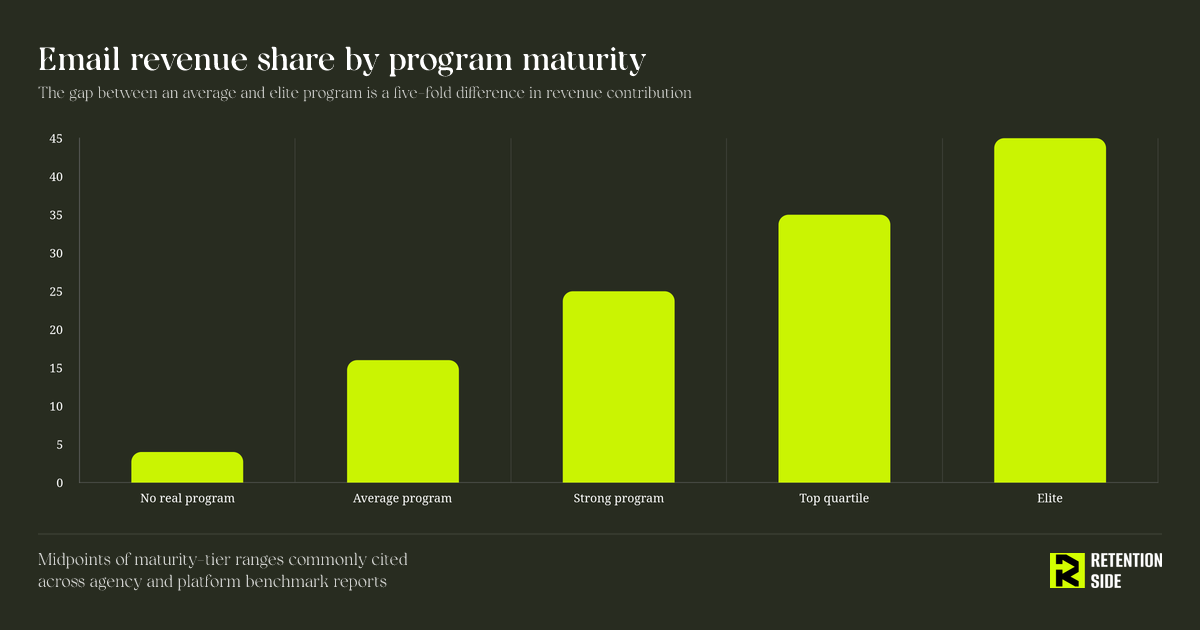
The pattern worth internalizing here is that the jump from “no real program” to “average” is smaller than the jump from “average” to “strong,” and the jump from “strong” to “elite” is often the hardest of all, because it requires predictive segmentation, disciplined testing, and list health management rather than just adding more flows. Most brands plateau in the “average” tier not because the channel has a ceiling, but because nobody goes back and rebuilds flows that were set up once and left alone.
This is also where deliverability becomes foundational rather than optional. A brand can have excellent flow coverage and smart segmentation, but if a meaningful share of sends are landing in spam or the promotions tab instead of the primary inbox, none of that architecture gets a chance to convert. Delivery and deliverability are not the same thing. An email can be technically delivered and still fail to reach anywhere useful. If your revenue share has plateaued despite solid flows, checking inbox placement, sender reputation, and engagement-based list hygiene should come before any messaging or offer changes.
Why your number might be lower than the benchmark, and that’s not always a problem
Not every gap between your email revenue share and the industry average is a sign that email is broken. A few legitimate reasons a brand might sit below the typical range:
A recent surge in paid acquisition can temporarily dilute email’s percentage share even while its absolute revenue holds steady or grows, simply because the denominator moved faster. A young list with low average tenure hasn’t had time to build the repeat-purchase behavior that drives flow revenue, particularly post-purchase and win-back sequences that depend on having customers far enough along in their lifecycle to reactivate. A brand in a genuinely low-frequency category, like furniture or major appliances, will structurally cap lower than a consumables brand no matter how well the program is run.
The diagnostic question isn’t “are we below 25%?” It’s “given our vertical, our list age, and our current acquisition mix, is our number consistent with a well-run program, or is there a specific gap, like missing flows, weak segmentation, or deliverability issues, that we can actually go fix?”
How to calculate your actual number without fooling yourself
Most platforms default to last-click attribution, crediting a purchase to email if it was the last touchpoint before conversion within a set window. This is useful as a consistent, comparable metric, but it understates email’s real influence in the customer journey, since email frequently nudges a purchase decision even when a different channel gets last-click credit, and it can overstate email’s role in low-consideration purchases where a discount code simply time-shifted a purchase that was going to happen anyway.
To get a usable number, pull total email-attributed revenue, whether flows and campaigns are broken out or combined, and divide it by total store revenue over the same trailing period, ideally a full year rather than a single month, since seasonality and one-off promotions can swing a monthly number significantly in either direction. Then look at the flow-to-campaign split within that number, because a healthy total percentage built on an inverted, campaign-heavy split is a less stable foundation than the same percentage built on strong flow coverage.
Diagnosing a shortfall: is it actually email, or is it something upstream?
Before assuming a low or declining email revenue share means the email program itself needs work, rule out the more common upstream causes.
Check whether traffic quality has shifted. If a paid channel started sending less qualified visitors, or if organic search brought in browsers rather than buyers, your list is capturing lower-intent subscribers who were never going to convert as well regardless of what your flows say. Check whether the website conversion path changed. A checkout redesign, a shipping cost change, or a new upsell that adds friction can suppress conversion rates on email-driven traffic even when the emails themselves are performing fine. Check list growth quality, not just volume. Form submission rate is a vanity metric if those leads never convert to customers. A pop-up offering a steep discount might inflate signups while pulling in subscribers who only ever buy once at a discount and never again, which drags down flow and campaign performance across the board even as your list grows.
Retention doesn’t operate in a vacuum. It depends on acquisition quality, website conversion quality, and consistency across every channel a customer interacts with. When we audit a brand’s email program at Retention Side, the first pass often isn’t about rewriting flow copy. It’s about figuring out whether the flows are actually the constraint, or whether the real leak is happening somewhere upstream that email can’t fix on its own.
Building toward your ceiling: a practical sequence
If your current email revenue share is below what your vertical and program stage should support, the fix usually follows a predictable order rather than a scattershot list of tactics.
Start with deliverability, because no amount of flow or campaign optimization matters if sends aren’t reaching the inbox. Then audit flow coverage against the full customer journey: welcome, abandoned cart, browse abandonment, post-purchase, replenishment where relevant, and win-back. Missing flows are the single most common gap we find in underperforming accounts. Next, look at segmentation depth in campaigns. A list divided into a handful of broad segments will consistently underperform one divided more deliberately by engagement, purchase history, and product interest. Finally, layer in testing discipline across subject lines, send times, incentive structure, and flow timing, because a flow built correctly a year ago is not guaranteed to still be your best version today.
None of this happens in isolation from the rest of your retention stack either. As list size and engagement grow, the right move is often to expand beyond email into SMS, or push notifications, or a loyalty program, depending on what your specific audience actually responds to and where the cost-to-reach economics make sense, rather than assuming email alone should carry every percentage point of the benchmark by itself.
Conclusion
There’s no single correct answer to how much revenue email should generate for your brand, but there is a defensible range, and there’s a clear way to figure out where you should realistically sit within it. Start with your vertical’s typical ceiling, layer in an honest look at your program’s maturity, particularly your flow-to-campaign split and deliverability health, and use that combination to set your actual target instead of borrowing a number from an industry report that averaged brands with almost nothing built next to brands with years of disciplined optimization behind them.
If your number is meaningfully below what your category and list size should support, the fix is rarely “send more emails.” It’s almost always a specific, findable gap: a missing flow, an inbox placement problem, an inverted campaign-to-flow ratio, or a list quality issue upstream of email entirely. Treat the benchmark as a diagnostic, not a scoreboard, and the actual work of closing the gap becomes a lot more concrete.