

Most brands treat email design as a creative exercise. Pick a template, drop in product shots, match the brand colors, ship it. That approach works fine until you look at the numbers underneath the campaign: opens that don’t translate into clicks, clicks that don’t convert, and a slow decline in engagement that nobody can quite explain.
Email design is not decoration. It is the mechanism that decides whether a subscriber understands your offer in the first two seconds, whether your CTA gets tapped on a cracked iPhone screen at a bus stop, and whether Gmail renders your carefully built layout or clips it into an unreadable mess. At Retention Side, we look at design as part of the same system that includes deliverability, flows, segmentation, and list quality. A beautifully designed email that lands in Gmail Promotions or gets clipped at 102KB is not a design win. It is a design problem wearing nice colors.
This article covers what actually moves the needle for ecommerce email design in 2026: mobile-first layout logic, the rendering constraints that matter most, CTA and hierarchy decisions, dark mode, accessibility, and how design connects back to the retention outcomes brands actually care about.
Key takeaways
- Mobile and webmail combine for more than 80 percent of how ecommerce subscribers read email, so single-column, mobile-first layout is the baseline, not an optimization.
- Apple’s rendering engine (including Mail Privacy Protection) and Gmail account for close to 90 percent of opens, which means design and QA time should go there first, not toward chasing every obscure client.
- One primary CTA per email is a discipline, not a suggestion. Competing CTAs split attention and reduce the click rate on the action that actually matters.
- Design decisions affect deliverability. Image-heavy, text-light emails, oversized HTML, and inconsistent sending patterns all increase the odds of landing in spam or Gmail’s Promotions tab.
- Dark mode is no longer an edge case. A meaningful share of your list reads email with inverted colors, and untested templates break in ways that look unintentional and cheap.
- Design should be built as a modular system in Klaviyo, not a one-off template per campaign. Consistency compounds; reinventing the layout every send does not.
- A drop in click-through rate is not always a copy or offer problem. Before you rewrite subject lines, check whether the layout, CTA placement, or rendering broke somewhere along the way.
What we’ll cover
We’ll walk through the rendering reality behind ecommerce email (who actually opens your emails and where), then get into layout, hierarchy, CTA design, typography, imagery, dark mode, accessibility, and how to build a template system in Klaviyo that scales across flows and campaigns without starting from zero every time.
Why design decisions start with rendering, not aesthetics
Before you pick a font or a button color, you need to know where your emails are actually being read. This is the part most in-house teams skip, and it is the reason a template that looks perfect in the design tool falls apart in a real inbox.
Apple Mail, including opens affected by Mail Privacy Protection, and Gmail together account for close to 90 percent of all email opens tracked by Litmus in 2026. Outlook, Yahoo Mail, and everything else make up the remainder.
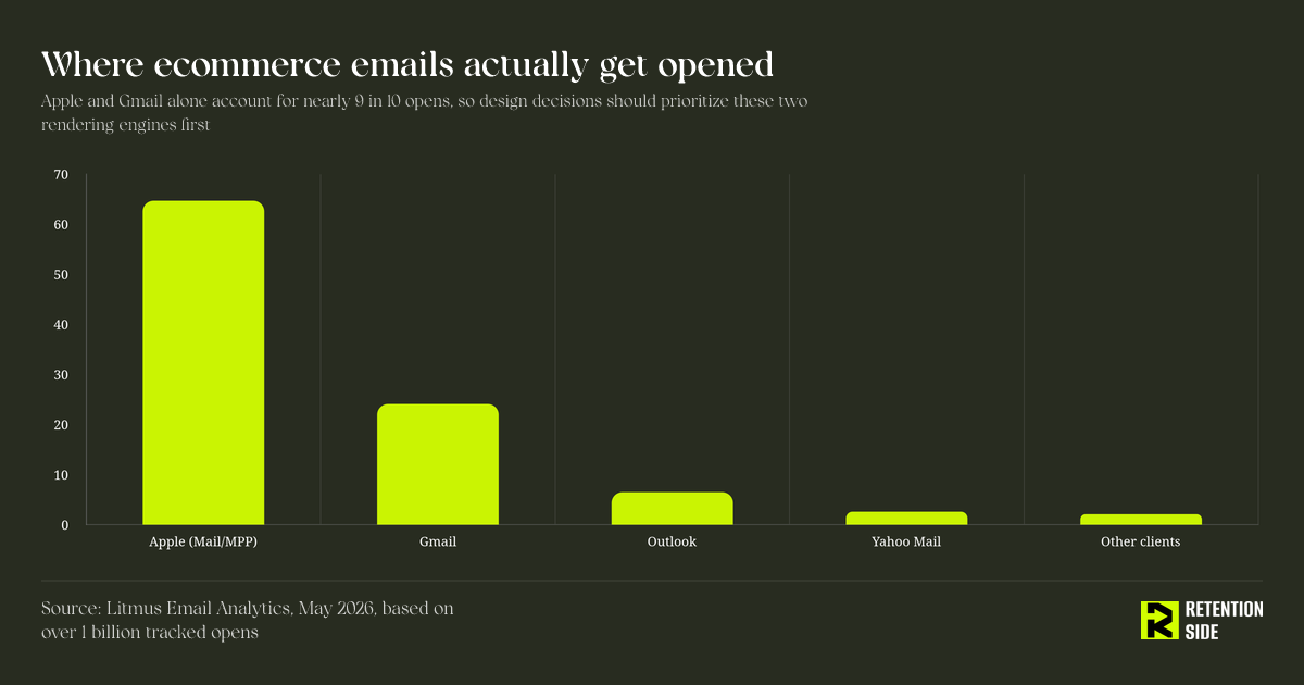
That concentration matters because these two environments have very different rendering rules. Apple Mail is relatively forgiving with modern CSS. Gmail is stricter, strips certain style tags, and clips HTML above roughly 102KB, which cuts off your footer, your unsubscribe link, and sometimes your legal copy if the email runs long with heavy inline styling or embedded tracking pixels stacked on top of images. Outlook desktop, while a smaller share of opens, still renders through a Word-based engine that ignores flexbox, grid, and a lot of modern CSS entirely. If your list skews B2B or includes any meaningful share of corporate email addresses, Outlook compatibility is still worth protecting even though its volume share is small, because a broken Outlook render in front of a buyer at a wholesale or B2B account can cost you a deal.
The device side of the equation reinforces the same point.
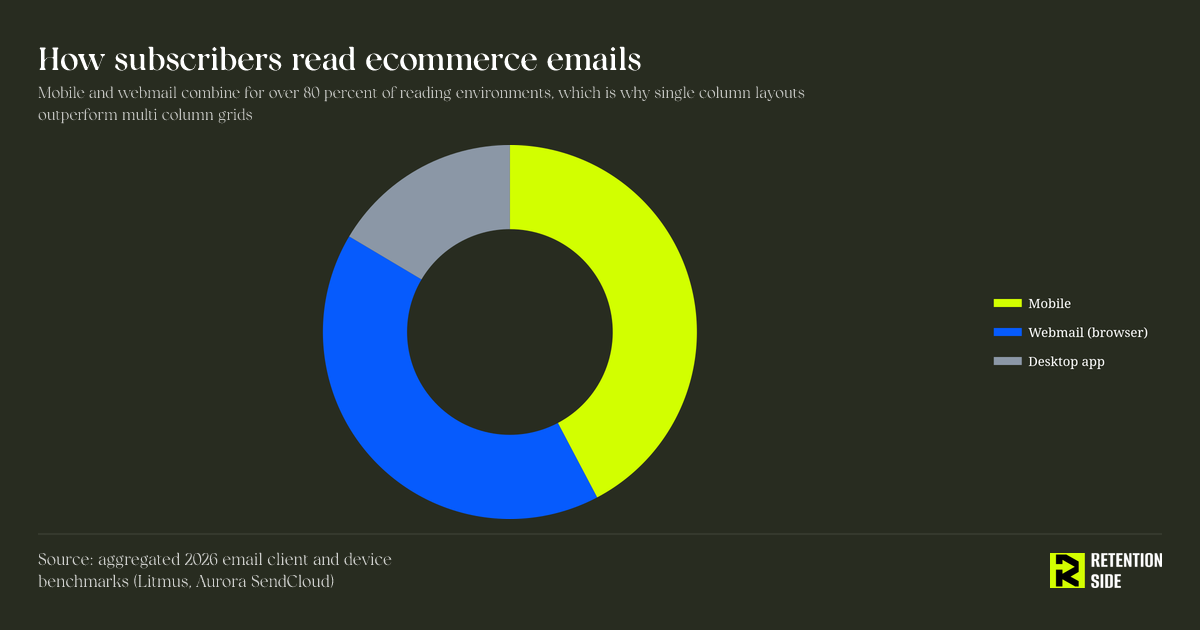
Mobile and webmail combined account for over 80 percent of how subscribers encounter your emails. Desktop app opens, the environment most forgiving of complex multi-column layouts, is a minority use case. If your template was designed and approved on a 27-inch monitor and never previewed at 375px wide, you are optimizing for the environment fewest people actually use.
This is also why we treat design QA as a deliverability conversation, not just a creative one. Delivery means the email technically arrived. Deliverability means it landed somewhere useful, meaning the inbox, not spam or the Promotions tab. Design choices influence that outcome. Bloated HTML, an unbalanced text-to-image ratio, spam-trigger language wrapped in image text that filters can’t read, and inconsistent structure across sends all feed into how mailbox providers score your program over time.
Mobile-first is not a checkbox, it’s a layout philosophy
“Mobile-responsive” gets treated like a technical setting you toggle on. In practice, mobile-first means every layout decision starts from the smallest, most constrained screen and works outward, not the other way around.
Single column beats multi-column almost every time
Multi-column grids look impressive in a design mockup. In an actual inbox, they force Gmail and Apple Mail to squeeze columns into tiny, tap-error-prone blocks on a phone screen. Single-column layouts stack cleanly, require no media query gymnastics to behave, and render predictably across Apple, Gmail, and Outlook. Reserve multi-column or zigzag layouts for specific use cases like desktop-heavy B2B sends or a very deliberate “shop the edit” grid, and test them before you rely on them.
Build for thumbs, not cursors
CTA buttons need a minimum tap target of roughly 44×44 pixels. Body copy should sit at 16px or larger with a line height between 1.5 and 1.8. Headlines need enough size and contrast to read without zooming. None of this is about making the email prettier. It is about removing the physical friction between a subscriber’s thumb and the action you want them to take.
Respect the fold, but don’t obsess over it
The top of the email should answer three questions almost instantly: what is this, why should I care, and what do you want me to do. That does not mean cramming everything above an arbitrary fold line, since fold position varies wildly across devices. It means front-loading clarity before you front-load decoration.
Visual hierarchy: controlling what gets seen first
Good hierarchy is the difference between an email that feels effortless to read and one that feels like a wall of noise. The goal is to control the order in which a subscriber’s eye moves: headline, supporting context, CTA, in that sequence, without competing elements pulling attention sideways.
One primary CTA, always
This is one of the most consistently ignored rules in ecommerce email design. Brands add a “Shop Now” button, a “View Collection” link, a footer CTA, and a banner CTA, all in the same email, and then wonder why click-through rate on the actual priority action is mediocre. Every additional CTA is a vote against your primary one. If you need to promote multiple things, prioritize ruthlessly and let secondary content live below the primary CTA, styled with clearly less visual weight.
Layout structures that actually work for ecommerce
- Single product layout: hero image, product name, a few benefit bullets, price if relevant, one CTA, supporting trust elements (reviews, shipping, guarantee) below. Best for launches and hero promotions.
- Multiple product layout: grid or list format, capped at 3 to 6 products max, each with its own image, name, price, and CTA. Best for collections, gift guides, or “back in stock” sends.
- Editorial layout: banner image, headline, short preview copy, a single “Read more” CTA. Best for brand-building or educational campaigns, which matter more than most brands admit. If subscribers only hear from you during discounts, engagement and full-price purchasing both decline over time, and editorial-style sends are one of the easiest ways to break that pattern without discounting margin away.
White space is a design decision, not empty space
Cramped layouts feel cheap and are harder to scan. Give content room: roughly 20px of padding around content edges, 30 to 40px between major sections, and consistent spacing between paragraphs and list items. This is especially important in flows like welcome series or post-purchase education, where you are asking a subscriber to actually read and absorb something, not just glance and click.
CTA design: the detail that gets rushed most often
CTA buttons get treated as an afterthought once the “real” design work is done, which is backwards, since the CTA is the entire point of most commercial emails.
A strong CTA button needs high contrast against its background, specific action language rather than generic text, and enough padding to feel tappable rather than decorative. “Shop the sale” outperforms “Click here” because it tells the subscriber exactly what happens next. Match the CTA language to the segment: a winback email talking to a lapsed customer should not use the same CTA copy as a browse abandonment flow talking to someone who viewed a product yesterday. This is where design and segmentation strategy actually intersect. A generic CTA in a highly targeted flow wastes the targeting work you already did.
Button color deserves the same scrutiny. It should stand out from the surrounding palette, not just match the brand’s primary color if that color happens to blend into the background. If your brand palette is monochrome, an accent color used only for CTAs can outperform strict brand consistency, and that tradeoff is usually worth making.
Typography, color, and the contrast problem
Typography in email is more constrained than typography on a website, and treating it the same way is a common mistake.
Stick to web-safe fonts with solid fallbacks (Arial, Helvetica, Verdana, Georgia) since custom webfonts render inconsistently outside of Apple Mail and Gmail and fail outright in Outlook desktop. Body text should sit at 14 to 16px minimum, headlines at 20 to 30px, with clear differentiation between the two so hierarchy reads instantly even at a glance.
Contrast is not optional. WCAG AA guidance calls for a 4.5:1 contrast ratio for body text and 3:1 for larger text. In practice: dark gray body text on white or near-white backgrounds, never light gray on white, and high-contrast button text against the button fill color. This is not just an accessibility checkbox. Low-contrast text is genuinely harder to read on a phone screen in bright daylight, which is a real-world reading condition for a meaningful share of your list.
Dark mode: still underestimated by most brands
A significant share of subscribers now read email in dark mode by default, across Apple Mail, Gmail mobile, and Outlook. The problem is that dark mode inversion is inconsistent and often unpredictable. White backgrounds can invert to near-black. Text that was dark for contrast on a white background may or may not flip with it. Logos and images stay as-is, which is exactly where most dark mode failures show up.
The fixes are practical rather than exotic:
- Avoid pure white (#FFFFFF) backgrounds, since they get inverted more aggressively. A soft off-white performs more predictably.
- Use transparent PNG logos instead of logos baked onto a solid white rectangle, which otherwise turns into an ugly white block in dark mode.
- Actually test dark mode rendering in iOS Mail, Gmail mobile, and Outlook rather than assuming your template “probably” holds up.
- Don’t rely solely on
prefers-color-schememedia queries, since client support is inconsistent enough that you need a template that survives even without that hook firing correctly.
Skipping dark mode testing is one of those gaps that doesn’t show up until a subscriber screenshots a broken email and posts it, or until you notice engagement quietly softening on a segment you can’t explain through segmentation or offer changes.
Images, file size, and the Gmail clipping trap
Ecommerce email leans heavily on product photography, and that is fine, but images introduce three risks that pure text does not: load time, accessibility gaps, and deliverability exposure.
Compress images aggressively. A hero image does not need to be a multi-megabyte file to look sharp on a phone screen, and an email that loads slowly on a spotty mobile connection loses attention before the subscriber ever sees the CTA. Add explicit width and height attributes so layout does not shift while the email loads. Add real alt text, not filenames, since a meaningful share of inboxes block images by default and your alt text becomes the entire message for that subscriber until they choose to load images.
Watch your text-to-image ratio. An email built almost entirely from a single large image, with all the copy baked into that image, is a spam-filter red flag and an accessibility failure at the same time. Filters can’t read text embedded in an image, screen readers can’t either, and if images are blocked, the subscriber sees a blank box. Keep a healthy mix of live text and imagery, and never let HTML bloat push you toward Gmail’s roughly 102KB clipping threshold, which will cut off your footer, your unsubscribe link, and anything else stacked at the bottom of a long, image-heavy template.
Accessibility is a design requirement, not a nice-to-have
Accessible design overlaps almost entirely with good design. Descriptive alt text, logical heading structure, sufficient contrast, and tap-friendly button sizing help every subscriber, not just those using assistive technology. A subscriber scanning email one-handed on a moving train benefits from the same large tap targets and clear hierarchy that a screen reader user needs. Treat accessibility fixes as core template requirements rather than a separate audit you run once a year.
Building a modular template system instead of one-off designs
The brands that stay consistent, and consistency is what builds the trust that drives repeat purchases, are the ones that build a modular template system rather than designing each campaign from scratch. A master template with reusable blocks (hero, single product, product grid, testimonial, editorial content, footer) lets you assemble a new campaign quickly without breaking brand consistency or reintroducing rendering bugs you already solved once.
This matters even more once you’re running email alongside SMS, push, and other retention channels, since a subscriber should recognize your brand instantly whether they’re looking at an email, a text, or a push notification. Design consistency is part of what makes a broader retention system feel coherent instead of like a collection of disconnected tactics. It is also part of why Retention Side treats template architecture as a strategic asset in Klaviyo builds, not a one-time design deliverable that gets handed off and forgotten. Flows and campaigns evolve constantly, and a template system that’s easy to update saves real production time every week rather than costing you a redesign every quarter.
Testing: design decisions should never be permanent
Every design choice covered here, CTA copy, button color, layout structure, image-to-text ratio, is a hypothesis, not a final answer. Continuous A/B testing across templates, subject lines, send times, and incentive placement is how you find out what actually works for your specific list rather than what a blog post says should work in general. If click-through rate drops after a redesign, that is useful signal. If it drops without any design change, look at traffic quality, list health, or a shift in customer behavior before assuming the template broke something. Design and performance are connected, but they are not the only variable in the system, and treating every metric dip as a design failure leads to unnecessary redesigns that don’t actually fix the underlying issue.
Conclusion
Ecommerce email design works when it respects the constraints of where and how people actually read email: mostly on mobile, mostly in Apple Mail or Gmail, often in dark mode, often with images off by default. Every principle in this article traces back to that reality. Single-column layouts, one primary CTA, tap-friendly buttons, dark-mode-safe colors, compressed images with real alt text, and a modular template system are not stylistic preferences. They are the practical response to how inboxes actually behave in 2026.
Design does not operate in isolation from the rest of your retention system either. A well-designed email built on a weak segmentation strategy, sent to a poorly maintained list, or undermined by deliverability issues still underperforms. That is the lens we bring to Klaviyo builds at Retention Side: design is one piece of a larger system that includes list quality, flows, campaign strategy, and deliverability, and it only pays off when the rest of that system is working alongside it.